Room at the Top
Volatility trends indicate market still has a way to go
by Steven M. Zimberg, CFP
Steve is someone who encountered the Coffee Coaster, possibly from Libertarian references. Then contacted me with an idea he's been restoring, which is societism (societism.org). If you had to define it in a phrase, I would call it liberty in community; please if you find time visit the Wikipedia page on societism and fight a few highly placed poobahs at Wiki who appear to not want to let you know about societism.
Per Steve: "This piece was originally written for Barron's Magazine back in 2008; it's interesting
to see that we are at the intermediate peak as predicted nearly 18
months ago... Of course they didn't use it but maybe I will remind them!"
In the mid eighties, I was fortunate to have an old-time chartist work
with me in my investment consulting practice. This was ideal because it
was before computers were monitoring stock market indices or other
traded securities and helped us considerably with our money management
services. His charts included research dating back to the turn of the
century. They each gave logical predictions of future market direction.
He would always carry his wares guarded in a full length black portfolio.
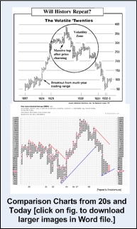
In one of his charts he called, "The Circle of Volatility", it
characterized a period of time similar to the 1929-1930s when stocks
moved much the same way as commodities. Its purpose was to trace classic
patterns that, when charted, closely resembled those of some commodities
that encountered disaster in the past, like silver during the Hunt debacle.
Spencer showed through his painstaking illustrations and foresight, his
prediction of how we again entered this circle in late 1987 (Barron's
July 20, 1987), coinciding with the Great Crash of October 1987. With a
law degree from China, he brought methodical patience and devotion to
presciently compare the Dow's pattern in 1987 with that of the
"twenties", which led to the Crash and the Great Depression.
This month's erratic fluctuations in market prices illustrate similar
characteristics that perhaps we are in that circle that occurs ever so
infrequently. Unique support that the bull isn't in immediate danger of
wandering into the slaughterhouse, that there is still room at the top.
Among the reasons for this: There are some important differences between
tops in stock markets and tops in commodities markets.
For one thing, the stock market usually takes a long time to top out.
For another, with few exceptions, it tops out in a rounded pattern,
followed by a spike that marks the ultimate apex. Commodities, on the
other hand usually make spiked tops, inspired by extraordinary news that
raises traders' pulse rates. In addition, unlike commodities futures,
stocks are frequently long term holdings, owned by individuals as well
as institutions. They are not merely "offsetting positions" or "open
interest", which can be wound up abruptly.
Then, too, all publicly traded companies do not move in sync; their
fortunes rise and fall individually, and movement is generally spread
over a relatively long period. For stocks, the tipping phase generally
is accompanied by good economic news and investor euphoria and
complacency. In contrast, the few dozen commodities that are traded
almost always top out within a relatively short stretch and, typically
amid panic conditions, such as the 14% inflation rate and 21% prime rate
that dealt the U.S. a terrible blow in 1980.
To illustrate our point, we had stockcharts.com prepare a point and
figure chart, to join our original.
The point and figure method is one of the oldest methods of charting. It
shows each consecutive price change of a certain size (for example $1)
during each trading day, but includes a notation only if a change of a
certain designated magnitude occurs. Obviously, depending on a company's
performance, investor interest and other factors, many such changes can
occur in one day, or none may be recorded for weeks at a time. In
essence, point and figure charts really are pure measures of price
movements.
Point and figure technique condenses multiyear price movements to
project upside or downside price targets. Point & Figure charts use
rising columns of X's and descending columns of O's to represent these
price movements. What an investor sees when looking at a P&F chart is
the underlying supply and demand of the security. The columns of X's
illustrate demand exceeding supply (rally), and the columns of O's
illustrate supply exceeding demand (decline). The numbers and letters
are used as monthly indicators, allowing the user to have at least a
rough idea of when these price movements occurred aside from the given
year markers at the bottom. The numbers 1 - 9 correspond to months
January thru September, and to save space, A B & C were assigned to
October, November, and December respectively.
For example, our work with such charts point to an ultimate target on
the low side being where we were last week around 7900 and reaching an
initial peak of 11,000 and perhaps an ultimate peak of even 19,000 in
the Dow before a bear market truly begins.
The scales have been adjusted to consider the ballooning of the Dow over
the past 80 years. The aim here is to put price changes into roughly
comparable perspective. Obviously, in percentage terms, a 10 point
change in the Industrials means a lot less now, while the Dow is in the
8,000-14000 range than it did when the average was around 375 in 1929.
The 20s chart is based on price moves of five point; the contemporary
one based upon 300 point moves. These charts are further refined by the
use of the three point reversal technique, which is useful in depicting
long term movements in the market. A reversal is simply a significant
change, either negative or positive, in the price of a stock or index.
Thus, the 20s chart reverses at 15, and the present chart at 900.
The Twenties chart shows that there were many price swings before a top
was reached. In fact, 1929 saw more point and figure price swings than
were recorded in all the previous 32 years. The chart also shows that,
before the calamity hit, a massive top was formed in 1929-30.
For the current market to have a top similar to that of the 1929-30, the
Dow would have to would have to spend much more time in a zone
characterized by torrid action and violent price swings. The area where
this is likely to take place lies in the Circle of Volatility as shown
in these two charts.
Even in today's economic climate with massive government cash infusions
to stimulate the world's credit markets, global real estate ownership
percentage values disappearing and foreclosures reminiscent of the past,
investors can breathe easy -- at least for awhile. Although the Dow
appears to have entered this yet to be charted circle of volatility,
despite widespread fears, we're not at the top just yet. Indeed, the
market probably has quite a way to go if a scenario like that of 1929-30
is to take place.
Spencer Lowe, you will always be remembered for your special wisdom,
devotion, friendship and of course, charting.
Steven Zimberg, CFP
President of
Asset Advisory Services, Inc.
Huntington Woods, Michigan
### 2010 October 19
Posted by The Coffee Coaster™ w/permission of the author
Stock Market | Twenties Chart | Steve Zimberg | Societism | Barron's


 Steve is someone who encountered the Coffee Coaster, possibly from Libertarian references. Then contacted me with an idea he's been restoring, which is societism (